The Importance of Brand Colours
Colour plays an important role in marketing. When designing the branding and logo of your company, colours play a crucial role. This is because they are the first things your target market thinks of when thinking of your brand. Colour is one of the first things your target market sees and can play a significant role in consumer behaviour.
When you think of Starbucks, you think green, when you think of McDonalds, you think of yellow arches and when you think of Facebook, you think blue. These brand colours are seen throughout the brands entirety. Facebook’s website is full of blue accents, the logo is blue, and blue is all throughout the user experience. Starbucks has green in their store, on employee uniforms, on the website and app, and on packaging. Colours are a great brand identifier and it is important they relate to your brand.
Colours and Emotions
Colours can elicit specific emotions and affect us in many different ways as they have the ability to create specific moods. Colour sets the mood of brand expression. Emotions are powerful and have the ability to drive decision making. Brands want to cultivate strong emotional connections with their customers and this can’t be done with just a logo; colours are needed to cultivate these emotions. How consumers feel about a brand has more pull than what they think of a brand. Furthermore, if you couple this with the fact that we know certain colours evoke certain emotions, your brand colours then have the ability to impact sales and performance.
Moreover, repetition of the same colour(s) can strengthen brand recognition and awareness. If you are consistent with your brand colours, they become part of your brand in the eyes of your target market. One way to be consistent is to incorporate your brand colours throughout the entirety of the user experience. This means having your brand colours in your brand collateral like your logo, website, storefront, in-store design, staff uniforms, packaging, and advertisements. Using the same colours in all your brand collateral strengthens your brand’s association with those colours and by extension, strengthen brand awareness as a whole.
With all that being said, you must choose your branding colours carefully as they have a direct influence on your brand identity. Before determining your brand colours, you must determine your brand identity and personality so you can pick colours that elicit that identity.
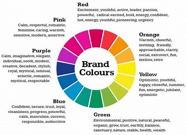
So you have your brand identity and personality, now you need to determine which colours match that. Here is a chart of brand colour meanings and the affect that the different branding colours can have on people.
Colour Meanings and their Affect on People
| Colour | Colour Meaning | Affect Branding Colours can have on People |
| Red | Passion, excitement, love danger, and anger | Signifies importance and commands attentionMakes you feel passionate and energized |
| Orange | Playfulness, vitality, happiness, and friendliness | It is invigorating and evokes energyAggressive but balancedMakes your feel energized and enthusiastic |
| Yellow | Happiness, youth, energetic, comforting and optimism | Makes you feel happy and spontaneousCan be attention-grabbing or affordableAssociated with laughter, hope and sunshine |
| Green | Stability, health, wealth, prosperity, calming, relaxing and growth | Has a connection to natureMakes you feel optimistic and refreshedDepicts growth, security and inspires possibility |
| Light Blue | Tranquility, trust, openness, calmness, spirituality, and innocence | Has a calming effectMakes you feel safe and relaxed |
| Dark Blue | Professionalism, security, and formality | It is mature and trustworthyToo much can make you feel cold and disengaged |
| Purple | Royalty, mystery, creativity, and luxury | It is wise and imaginativeMakes you feel creativeLighter shades are used to soothe or calm |
| Pink | Femininity, romance, sensitivity, tenderness, sweet, cute, charming, youth, and innocence | It ranges from modern to luxuriousMakes you feel playful and romantic |
| Brown | Rugged, aged, stability, support, warm, practical, dependable and earthy | Has an old-fashioned/vintage look or mood Makes you feel down to earth |
| White | Cleanliness, virtue, pure, health and simplicity | It can range from affordable to high-endMeans minimalism and simplicity |
| Gray | Subdued, classic, responsible, dependable, serious, mysterious, and mature | Stands for neutralityFeels serious and professional |
| Black | Powerful, elegance, sophisticated, edgy, professionalism, simplicity, luxurious, and modern | Makes your feel sophisticated, classic and seriousCan also refer to mourning or sadness |
Picking your Brand Colours
When picking your brand colours there are a number of things to be considered. First, you need to think of your target audience. Who is your target audience, what do they care about, what mood do they need to be in to engage with your products and brand? What colour best anchors the meaning of your value proposition to your target market and distinguishes you from the competition? You must ask these questions before determining which colours suit your brand best. You should also consider where your consumers are using your product; if it is outdoors, you may want to bring in colours from the atmosphere and place your product is used like green and brown for trees or blue and sand for a beach.
You also have to consider what the colours you choose mean in different cultures; especially if your brand is present outside of your home country. Colours mean different things in different cultures so you want to be sure these interpretations are in line with your brand. Furthermore, colour perceptions and meanings change with age, social class, gender and religion as well, which is why it is so important to understand your target market. Again, it is critical to understand your brand personality traits too. Your brand personality traits coupled with your target customers should be the foundation of your brand colours.
Recent Comments